Which train?
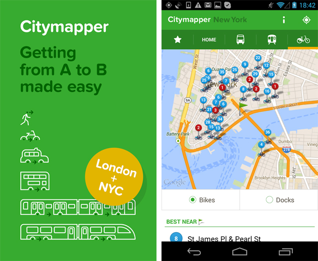
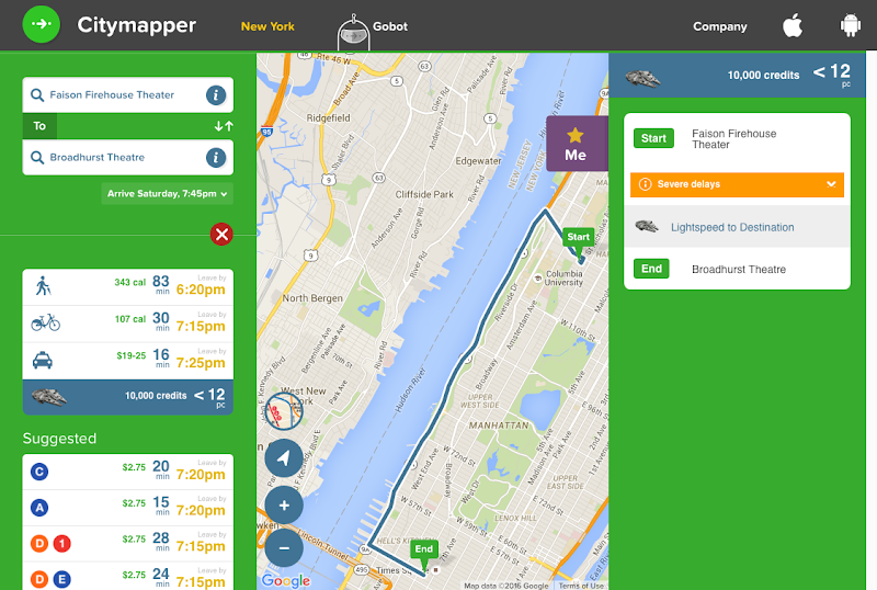
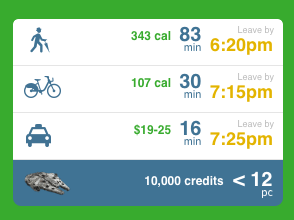
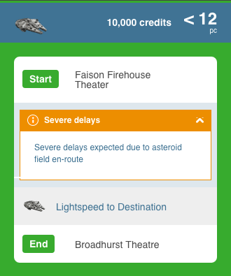
One of NYC’s favorite pasttimes is picking an optimal commute route, based on time, amount of walking, number of transfers, and some other trivial things. I was looking for the hopstop website (used this 6 years ago), but it doesn’t exist anymore. Citymapper popped up in search results so I took a peek. Turns out they have super awesome UI features like showing calories burned, fare & commute times as well as a lightspeed option (scroll down to see lightspeed)
This afternoon I’m performing in a show up in Harlem then later in the evening need to catch a musical down in Theater District.
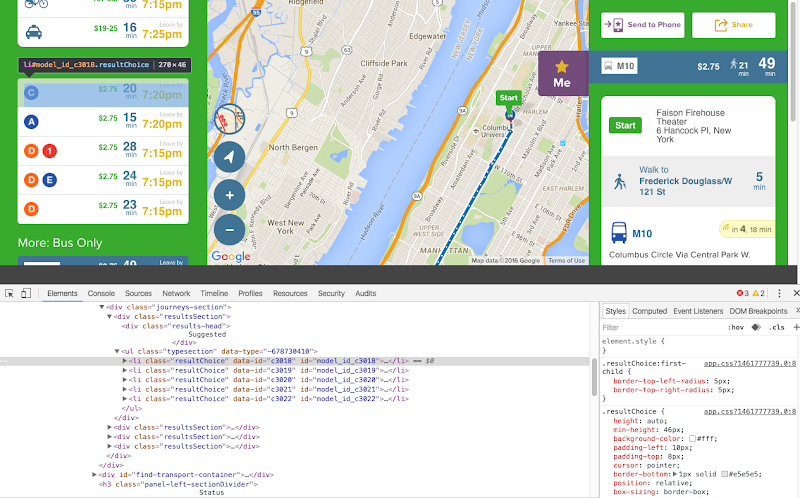
Took a peak under the hood to get a better idea of this app in how they render the UI.
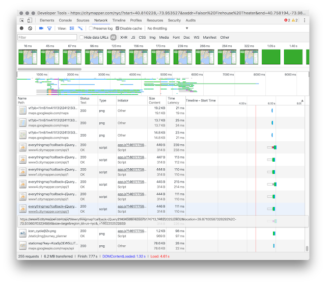
Also of interest was the network panel in Chrome Developer Tools, it measures the network performance of a website. It took 10.21 seconds to load 1.2MB and 286 requests, which is average loading time.
And then I noticed… when you load the page with chrome developer tools open, you get to see lightspeed directions as well ![]()
I looked up more information about this company and to get a better idea of how they create this product. First stop is Crunchbase to see their profile. They recently raised 40M funding and explained their process on their blog: From A to (series) B
Their software engineer job posting describes, “We use a lot of Python and some C++ and Java” and their map and commute data comes from General Transit Feed Specification (GTFS) and OpenStreetMap.
Up until this point I had only known about Transitfeed’s archive of GTFS feeds… so glad to know Citymapper already built a bunch of awesome features!
This post was not sponsored and is not affiliated with CityMapper.