This is a continuation from part 1 that covered connecting to the api.
As mentioned previously, last week I was working on a data visualization project. I prototyped my ideas in Python (later rewritten in Haskell). For this article I wanted to focus more on making the data accessible. The overall goal of the exercise was to take collected data about my most recent facebook posts, and better understand my behaviors. In the first part I saw that I was most active on Sundays. I became more curious on a further breakdown of my activity, and wanted to visualize the data.
Wanted to brush up and review my skills in coding, so instead of using many software available out there1, I decided to try this lengthy process.
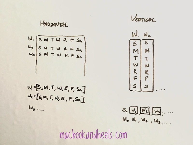
Thinking about other data viz I’ve come across, I really liked Github’s activity tiles on the profile page and was hoping to design something similar. Instead of completely imitating their design, I went with horizontal instead of vertical weeks. Basically showing the tiles in a typical month view layout. I explain a bit my design process before coding below.
Designing before coding
To begin with the design, I thought about how the data structures would look like and how to get them to fit into the resulting visualization. While Github has a vertical week view like on the right side of the whiteboard, they are showing all 52 weeks in a year, whereas I was only trying to show a month. So I went with the design on the left as it would also be easier to reuse the data structures from part 1.
Designing is a process of coming up with rationale for why you’d choose among many options, with an intent to provide a cohesive and consistent experience.
Did you know it’s easy to get a white board up in your room? I bought a large roll of sticky whiteboard paper from amazon for 10.99+tax (link) and stuck it on my door.
Reading a json file
I saved the filename in a separate config file in a separate local folder, _keys in a file name facebook.py. Inside you want to save a string type variable like the following:
data_file="XXXXXX"
Then you can import this variable like so:
from _keys.facebook import data_file

import json
with open(data_file) as json_data:
    data = json.load(json_data)
To verify that it indeed did work, you could print out the size of this list to see how many records were read:
print (len(data), "posts in this file")
In the above code, we read the text file and saved the JSON data to the variable data to work with. Now that we have data, we can move onto the fun part.
Review list comprehensions and sequential functions
We need to pull the time stamps out of data (it contains additional fields like author, content, etc which is information for another post). With the timestamps we can figure out the day of week it falls upon. Our workflow here will require us to convert a list of timestamps into a list of formatted timestamps.
But first, we import datetime and parser to help us bootstrap into the funner parts. Timestamps are tricky to work with and fortunately python has decent support in working with ‘em.
from datetime import datetime
from dateutil.parser import parse
The chart requires data from March, so our objective here is to create a slice of data of only March posts. I collected posts from January 2017 thru the middle of March 2017, and now I only want to look at posts from the last 3 weeks. How is slicing done? Why let’s review filter() again!
filter(function, iterable)
Construct an iterator from those elements of iterable for which function returns true. iterable may be either a sequence, a container which supports iteration, or an iterator. If function is
None, the identity function is assumed, that is, all elements of iterable that are false are removed.Note that
filter(function, iterable)is equivalent to the generator expression(item for item in iterable if function(item))if function is not None and (item for item in iterable if item) if function is None.See itertools.filterfalse() for the complementary function that returns elements of iterable for which function returns false. Docs
A lot of words to say a new list can be created from another, where a certain condition matches. Also, list comprehension is possible. I chose to use filter and lambda since I want to practice them, but the choice is up to you on whether you prefer list comprehensions or not.
#limiting to just march posts, formatted for readability
march_posts = list( filter(
                    lambda x: parse(x['created_time'][:-5]) >= datetime(2017, 3, 1)
                    , data
                  ))
What do we get from just the posts in march? It’s a good practice to peruse your results at each step to make sure you’re on track. Here I print the results, or length() of the new list, march_posts
print( len(march_posts)
     , "posts since", datetime(2017, 3, 1).date()
     )
Again, formatted the code for readability. Normally I write it in one line.
21 posts since 2017-03-01
The result looks good, and if I want to count the occurrence of each day of week and I can do that with:
# get days to count occurrence
march_days = list (map( lambda x: parse(x['created_time']).strftime("%A"), march_posts ))
As a recap from the last post, the time format is defined in the python docs. The string format of "%A" shows day of the week. Now that we have that, we can print out the day as well as the number of times that day occurs in the list.
# count number of posts by day of week
for day in march_days: print(day, " \t", march_days.count(day))
The following is the output. Not so clear, which makes it lack usability.
Sunday  	 8
Sunday  	 8
Sunday  	 8
Sunday  	 8
Friday  	 4
Thursday  	 4
Wednesday  	 2
Sunday  	 8
Sunday  	 8
Saturday  	 3
Saturday  	 3
Friday  	 4
Friday  	 4
Friday  	 4
Thursday  	 4
Thursday  	 4
Sunday  	 8
Sunday  	 8
Saturday  	 3
Thursday  	 4
Wednesday  	 2
Showing this text output as an example of why it’s not the best thing to do for reporting findings. What would make it better is a chart to condense the information and make it more readable. Let’s make charts.
Creating the chart
Matplotlib was created back in 2002 by John D. Hunter, who sadly has passed. He created Matplotlib at a time where there weren’t many good visualization tools. Nowadays there are many options, so the selection of using matplotlib here for prototyping designs is dedicated to him and his contributions to open source over the years.
Setting up matplotlib
To use matplotlib, you have to install and import it to your project. This is the basic Python workflow. Install someone’s library via pip, import it to your project.
-
pip install matplotlibto install it -
import matplotlibto import it, oftentimes written asimport matplotlib.pyplot as plt
Note: Often times examples found online use numpy. It’s a numerical procession library, and you can install and import it similarly. It’s often imported as np variable for brevity, so you’ll see import numpy as np
Heatmap examples
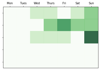
I’m interested in the heatmap type of visualization because I’d like to show blocks in a grid. Heatmaps tend to be used for more complex data, but here my dataset is so small it’s basically a toy exercise and yet principles and techniques can still apply.
I’d be looking at a 5 x 7 grid to indicate a month, rather than the examples below that include 6 x 10 or more!
Other examples include this nba data visualization
Creating plots
The basic framework for creating a matplotlib visualization is to (1) create a frame, (2) fill it in with the data, then (3) configure the settings, and (4) finally announce that it’s ready to be shown ![]()
# 1) create a frame
fig, ax = plt.subplots()

# 2) fill frame with data
heatmap = ax.pcolor(activity, cmap=plt.cm.Greens, alpha=0.8)

# 3) configure the settings

# put the major ticks at the middle of each cell
ax.set_xticks(np.arange(0,7)+0.5, minor=False)
ax.set_yticks(np.arange(0,5)+0.5, minor=False)

# want a more natural, table-like display
ax.invert_yaxis()
ax.xaxis.tick_top()

# labels
column_labels = ["Mon", "Tues", "Wed", "Thurs", "Fri", "Sat", "Sun"]
ax.set_xticklabels(column_labels, minor=False)
ax.set_yticklabels(list(''), minor=False)

# 4) announcing readiness!
plt.show()
Going to leave the explanation of specific matplot lib functions for another time. The variable activity above took a lot of tweaking to maneuver into a list of list, and you can see how it’s done in the accompanying notebook.
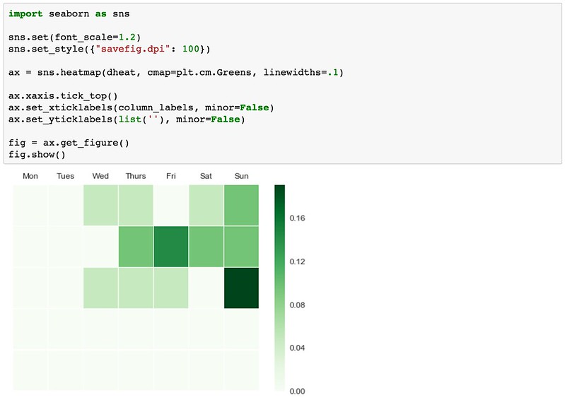
Seaborn library
In the last 5 years a whole bunch of new tools became available for data visualization in Python. I’m trying out seaborn here because they support heatmaps. I wanted to see how the look of this is different.
import seaborn as sns

sns.set(font_scale=1.2)
sns.set_style({"savefig.dpi": 100})

ax = sns.heatmap(activity, cmap=plt.cm.Greens, linewidths=.1)

ax.xaxis.tick_top()
ax.set_xticklabels(column_labels, minor=False)
ax.set_yticklabels(list(''), minor=False)

fig = ax.get_figure()
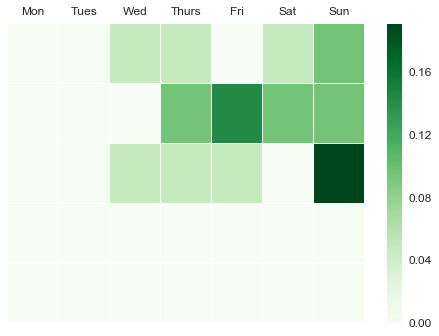
It’s been great to execute the design ideas. It took way longer to explain how it’s done than to actually write the code, but I wanted to explain to those who might be new to this.
Don’t forget that the code is available as an ipython notebook view as well.